Savvy
Design: Branding & Visual Identity, Product, User interface (UI), User Experience (UX); prototyping, User Research — 2024.

Overview
Timeline: 4 months
My role: Lead designer, researcher
Responsibilities: branding & design, copywriting, prototyping, user research, wireframing.
User group: Working adults with consistent income
The problem: A young professional needs help creating a budget and savings plan due to a lack of awareness about spending habits and the challenge of living paycheck to paycheck.
The goal: Our finance and budgeting app will help users new to budgeting create and manage their first budgets and savings plans.
Pain Points
The most obvious pain point for the target audience is that no current app allows them to create both budgets and savings goals. Someone wanting to do both would have to use multiple products to accomplish their financial goals — an admittedly poor user experience, not to mention frustrating. Aside from the market gap, I observed that some budgeting apps were overly complex; key features were buried in submenus, or the app itself was created for someone already very financially literate. While these apps have value in the market, they’re very intimidating to budget newbies.
Persona
Kayla is a young professional in her late-20s living in Pittsburgh, PA, with her fiance and their dog. She thought she just needed to make more money to have her dream life, but she’s tired of living paycheck-to-paycheck and not knowing where her extra money goes every month. She wants to create a budget that works for her household and save money while tracking progress toward her financial goals.
“I need to get my sh*t together!”
In the research phase of this project, I conducted a competitive audit of existing budget and savings apps. I evaluated the user experience of each competitor, as well as product offering, target audience, and unique value propositions. Prior to conducting this research, I assumed there were apps that already offered both budget and savings services. However, my research revealed that there are a lot of apps available to create your own budget, but not many that help users create savings goals, and none that offer both services to their users.
Research
Design
User Flows
Wireframing & Prototyping
My goals while wireframing were to organize the information in ways that were most intuitive for the user. Creating five versions of each page before digitizing allowed me to push my creativity and conceptualize design solutions that I wouldn’t have considered otherwise. Wireframing put me in the user’s shoes and helped me adapt the user flow to create an optimal experience for the user.
After the paper wireframes were finalized, I re-created them in Figma, and the wireframes evolved into a functional lo-fi prototype.
Evaluation & Iteration
Usability Testing
After creating the lo-fi prototype, it was time to get feedback from users. I planned a UX research study to determine:
ease-of-use of the app
if the default budget items are unbiased and thorough
if both app goals are of use to the same user
if the design is appropriately accessible
Questions the research should answer:
How did you feel when using the app?
Is the default budget inclusive of your regular expenses?
How did you feel when navigating the app?
Do you feel that the savings goal feature will affect your savings practices?
With these questions and goals in mind, I conducted an unmoderated usability study, with time-on-task and a system usability scale serving as our KPIs. The study’s participants were all adults who have regular income (i.e. full- or part-time employment, government assistance, stock dividends, etc) and also have recurring bills and expenses.
Findings
Overall, responses were relatively positive and some patterns emerged. The majority of participants felt positively about their experience using the app, that they would use both budget and savings functions, and that the default budget options were adequate for creating a first budget. However, they also noted cosmetic issues with the app (i.e. lack of customization & inconsistency in some features) and had specific critiques about the app’s visual design. From these findings, I developed the following insights:
when the basic functions of an app are in place, users notice design inconsistencies
we need to use clear iconography and ensure all type meets accessibility standards
the budget creation flow needed further streamlining
the budget and savings goal flows lacked visual consistency
Iteration
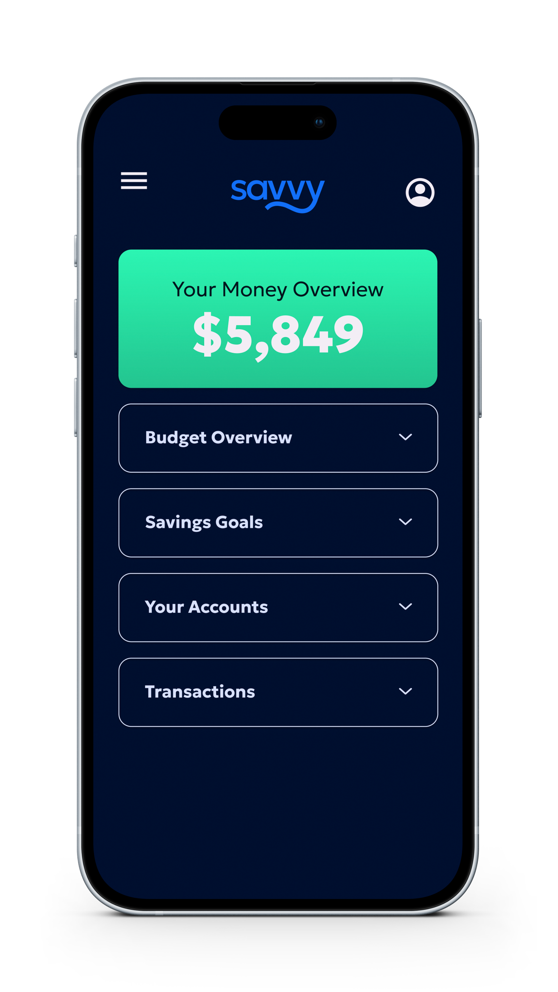
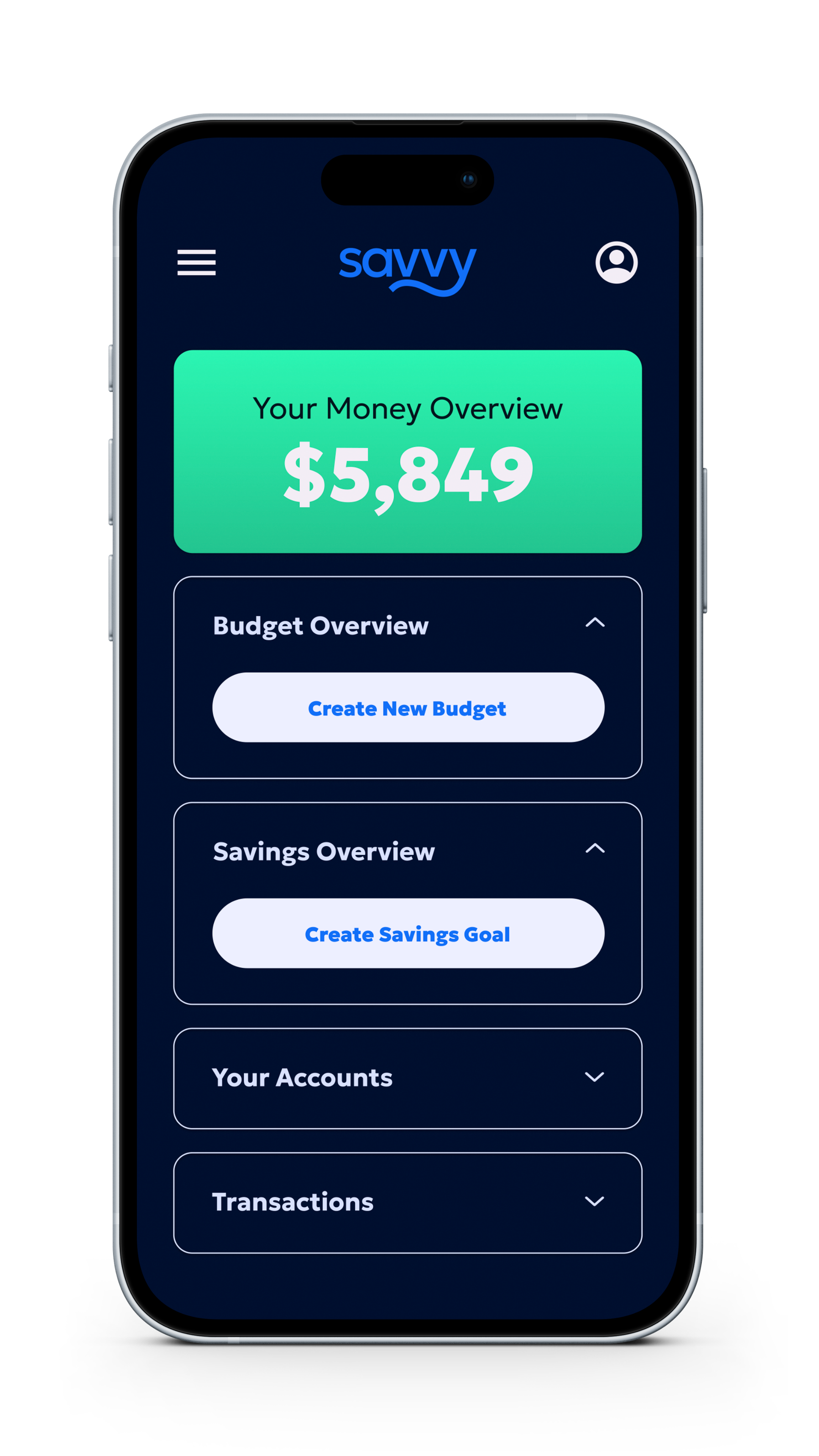
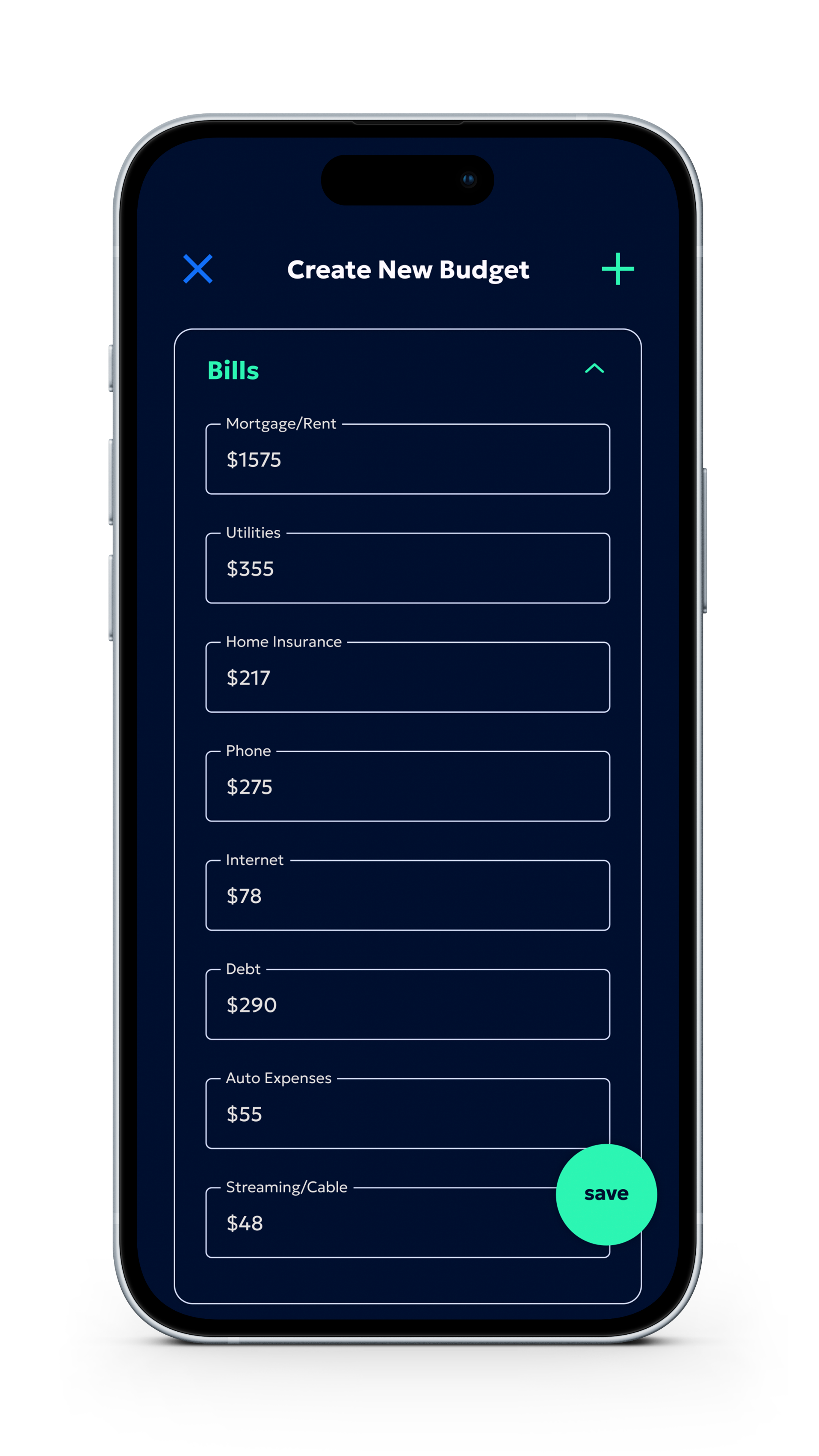
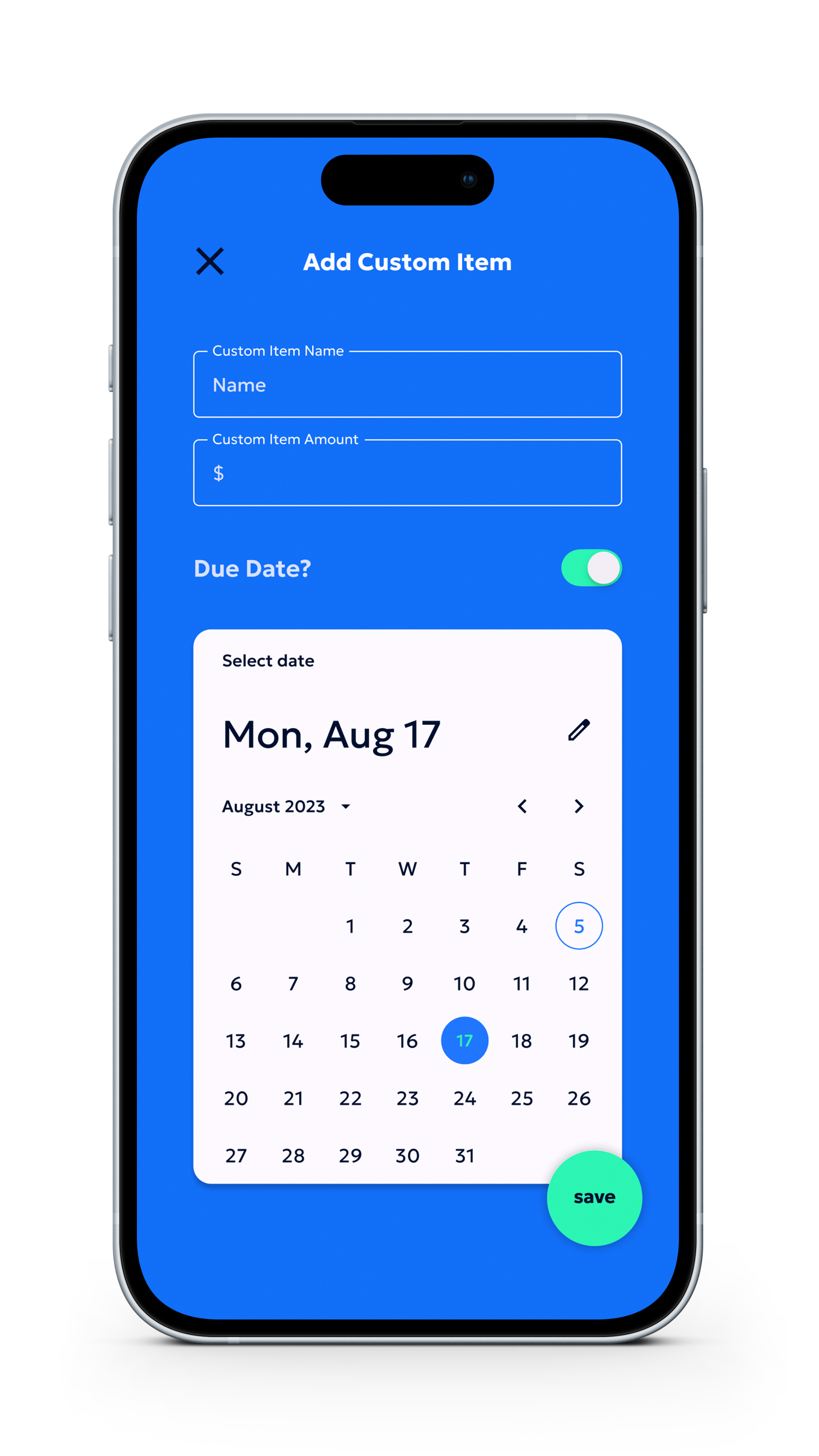
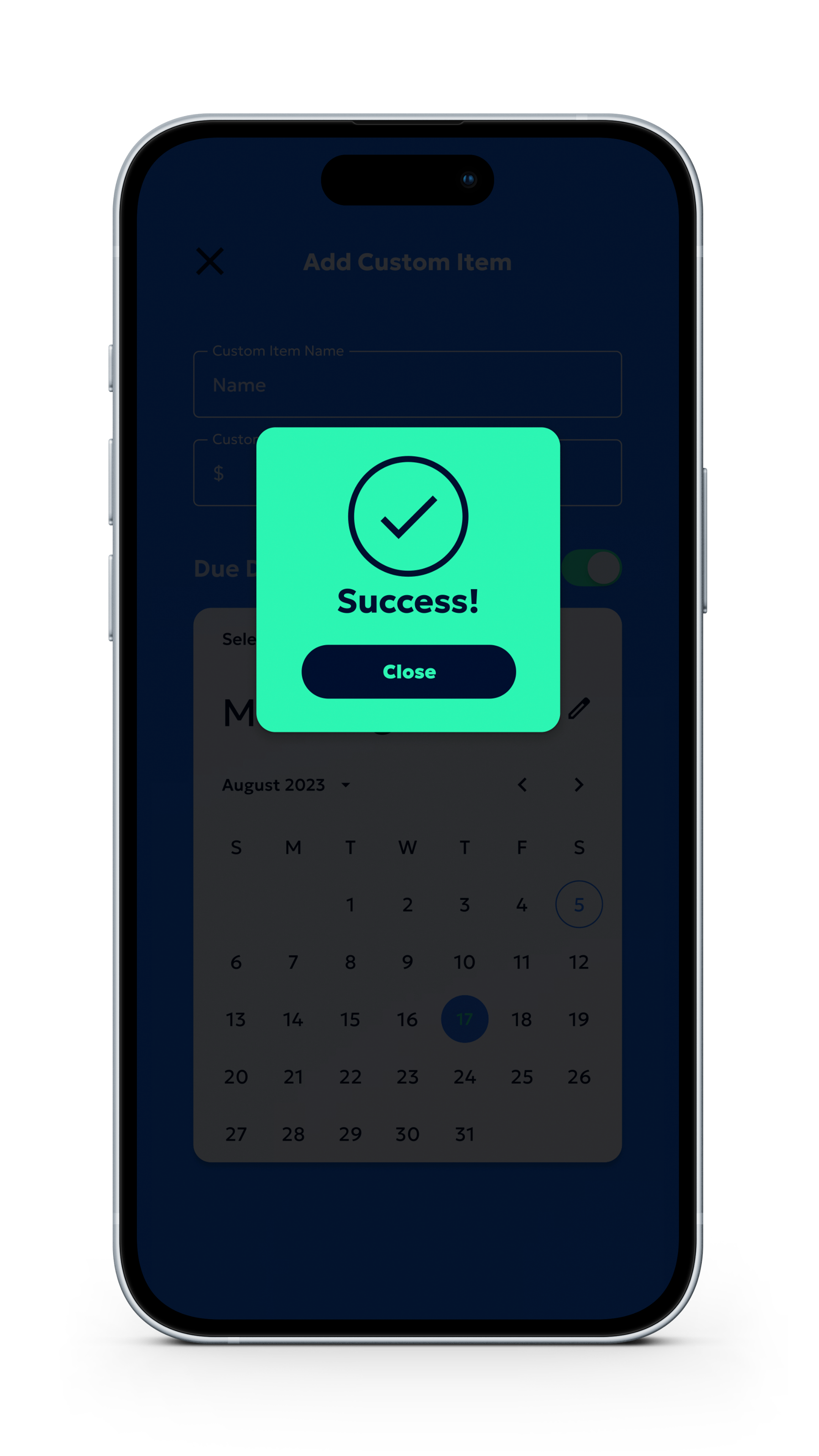
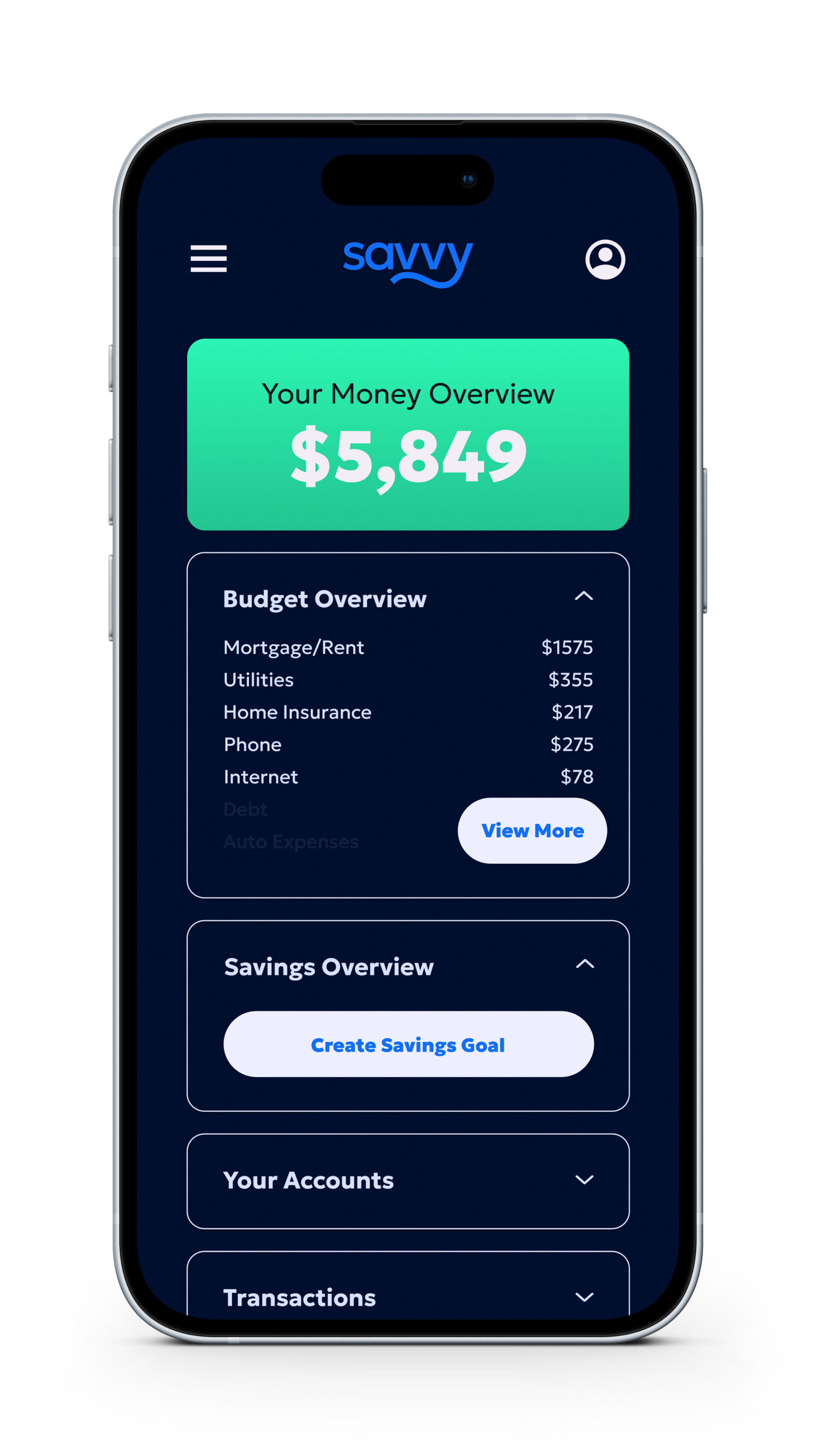
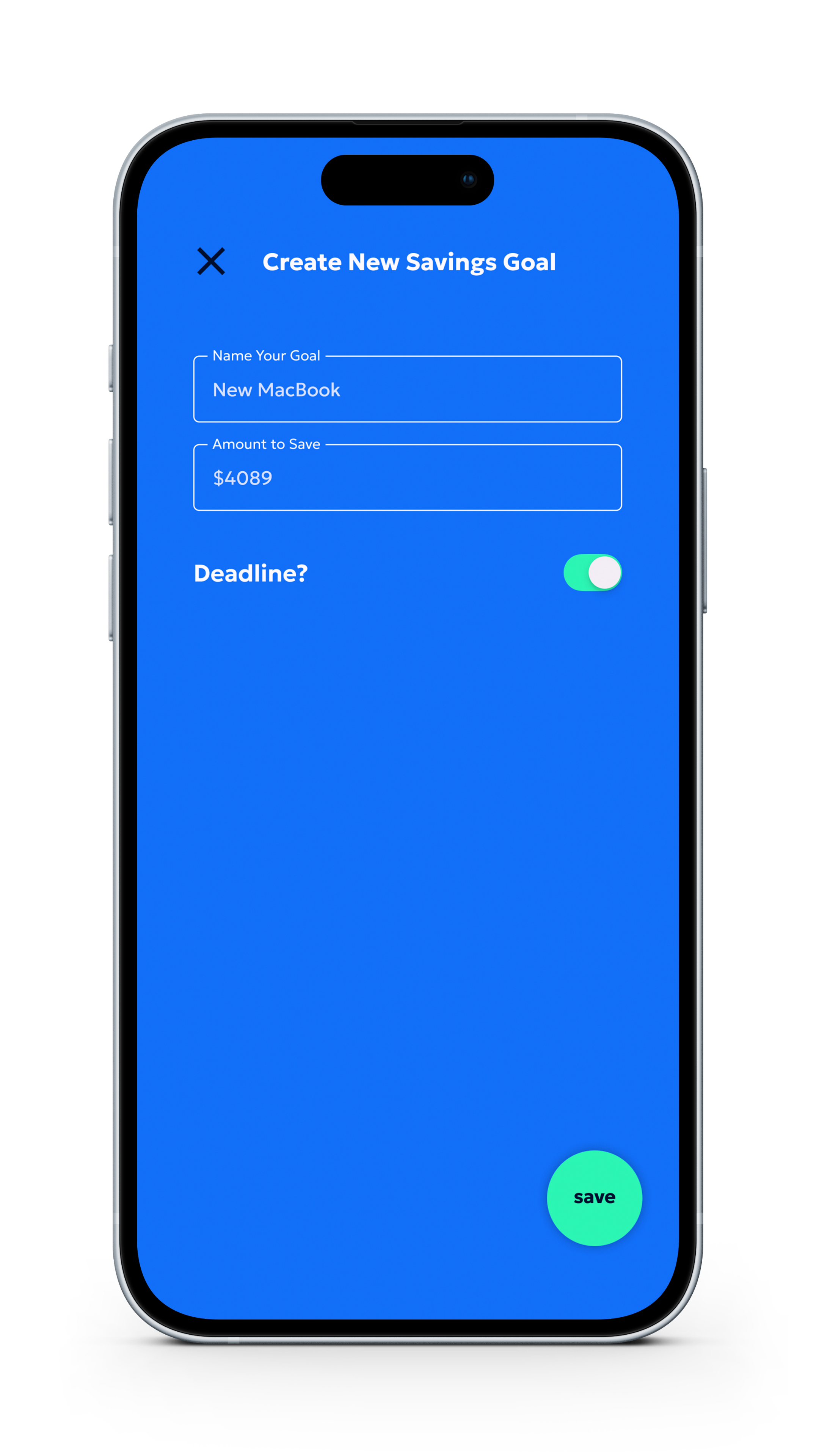
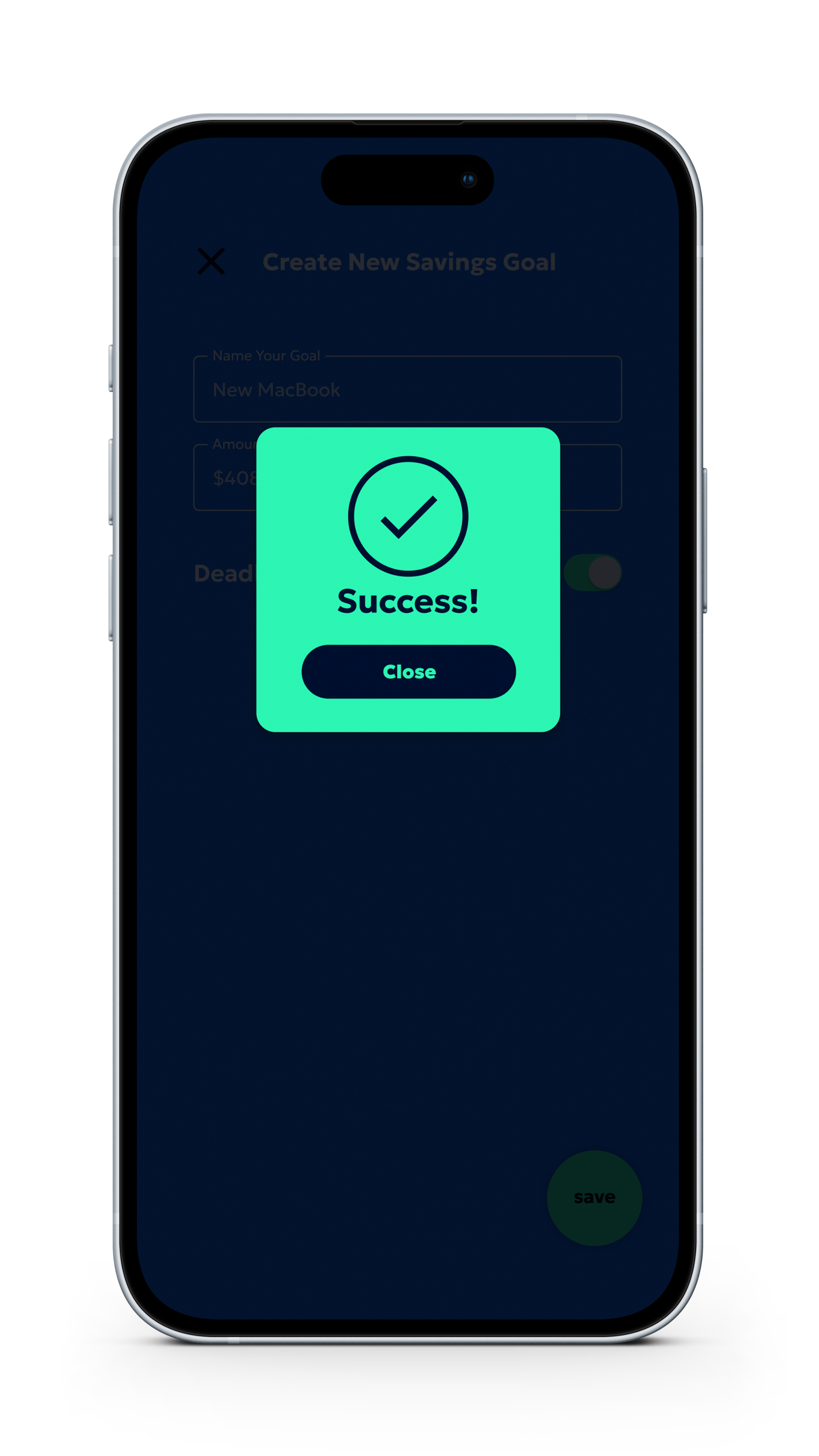
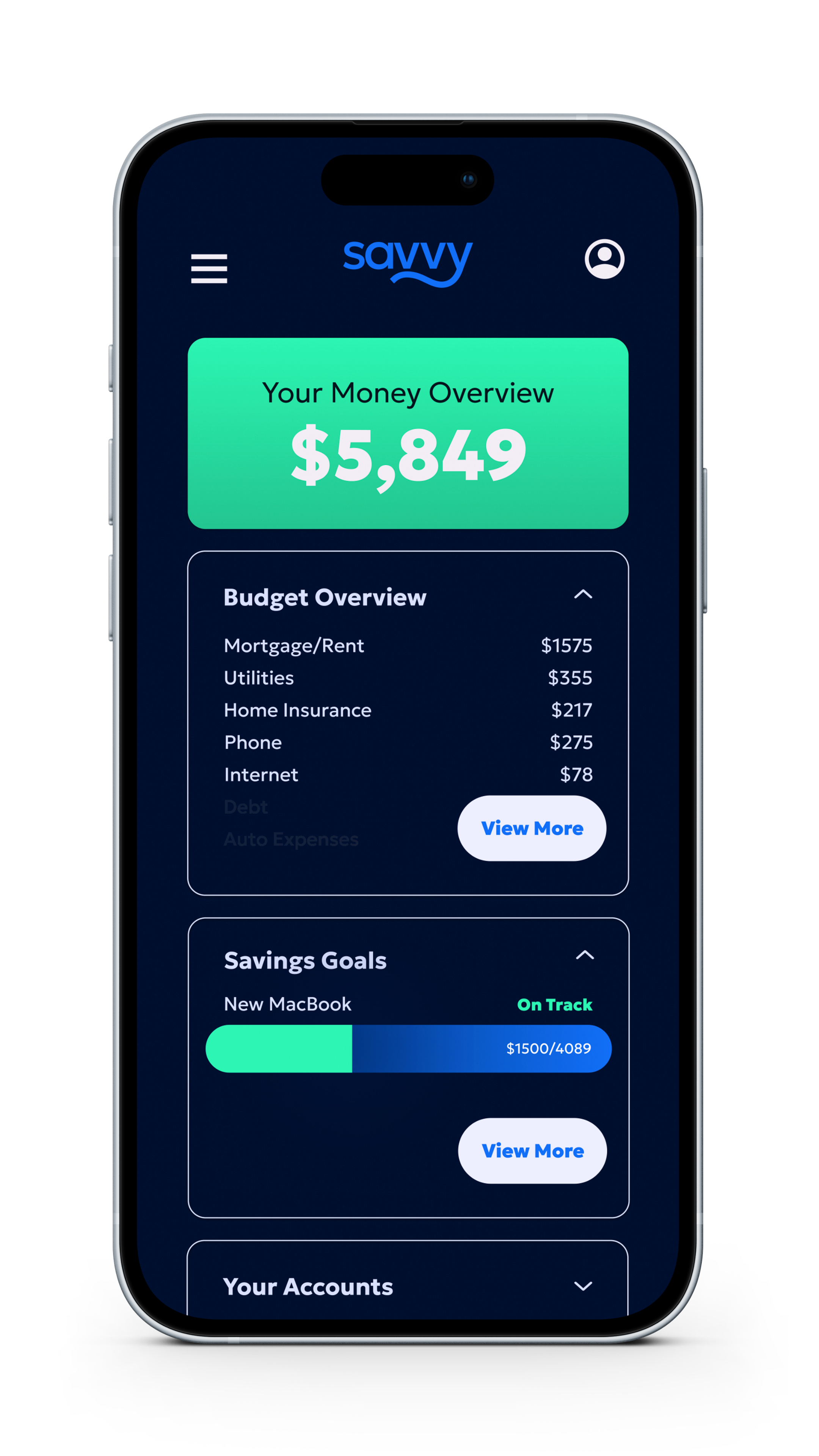
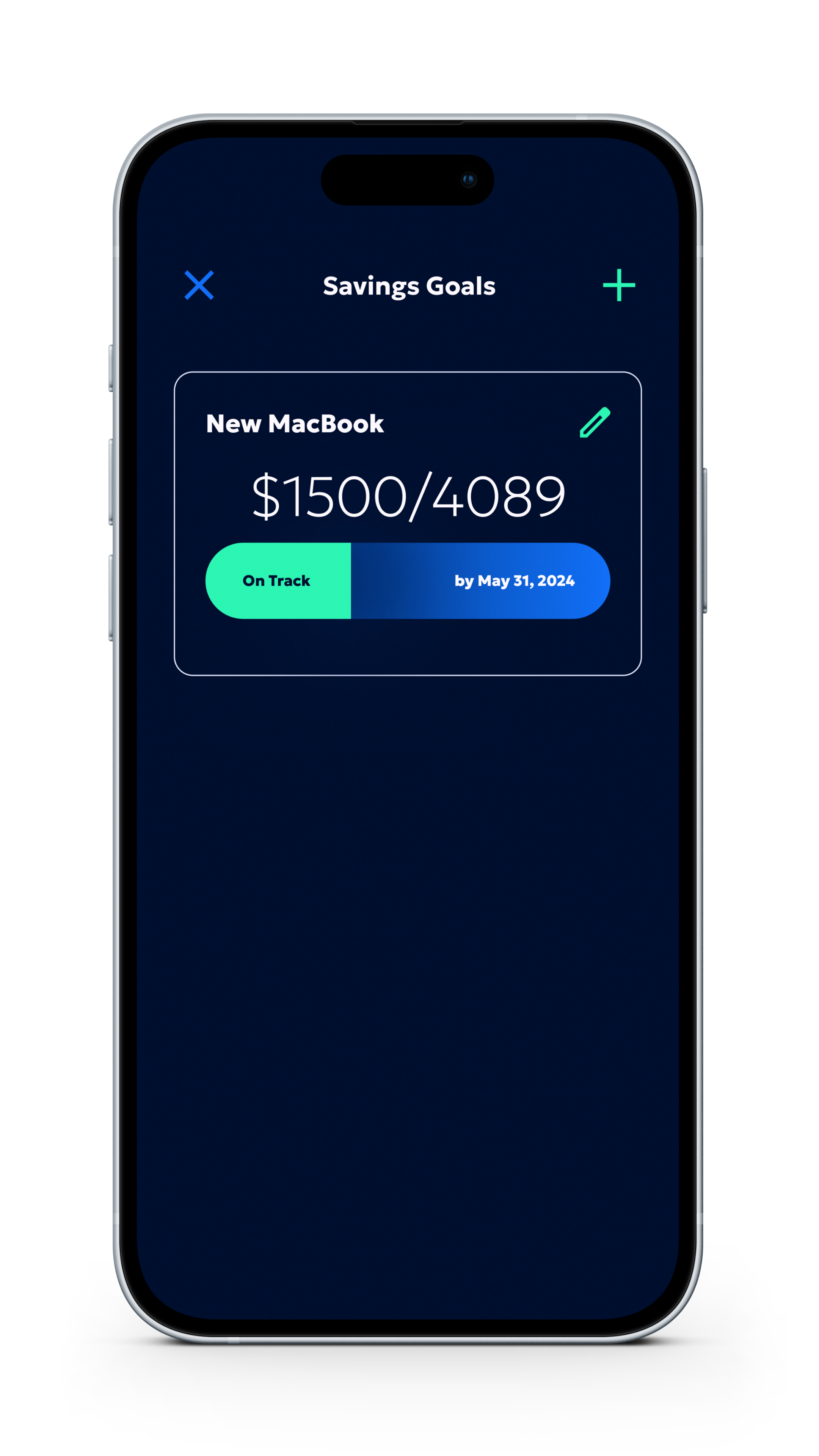
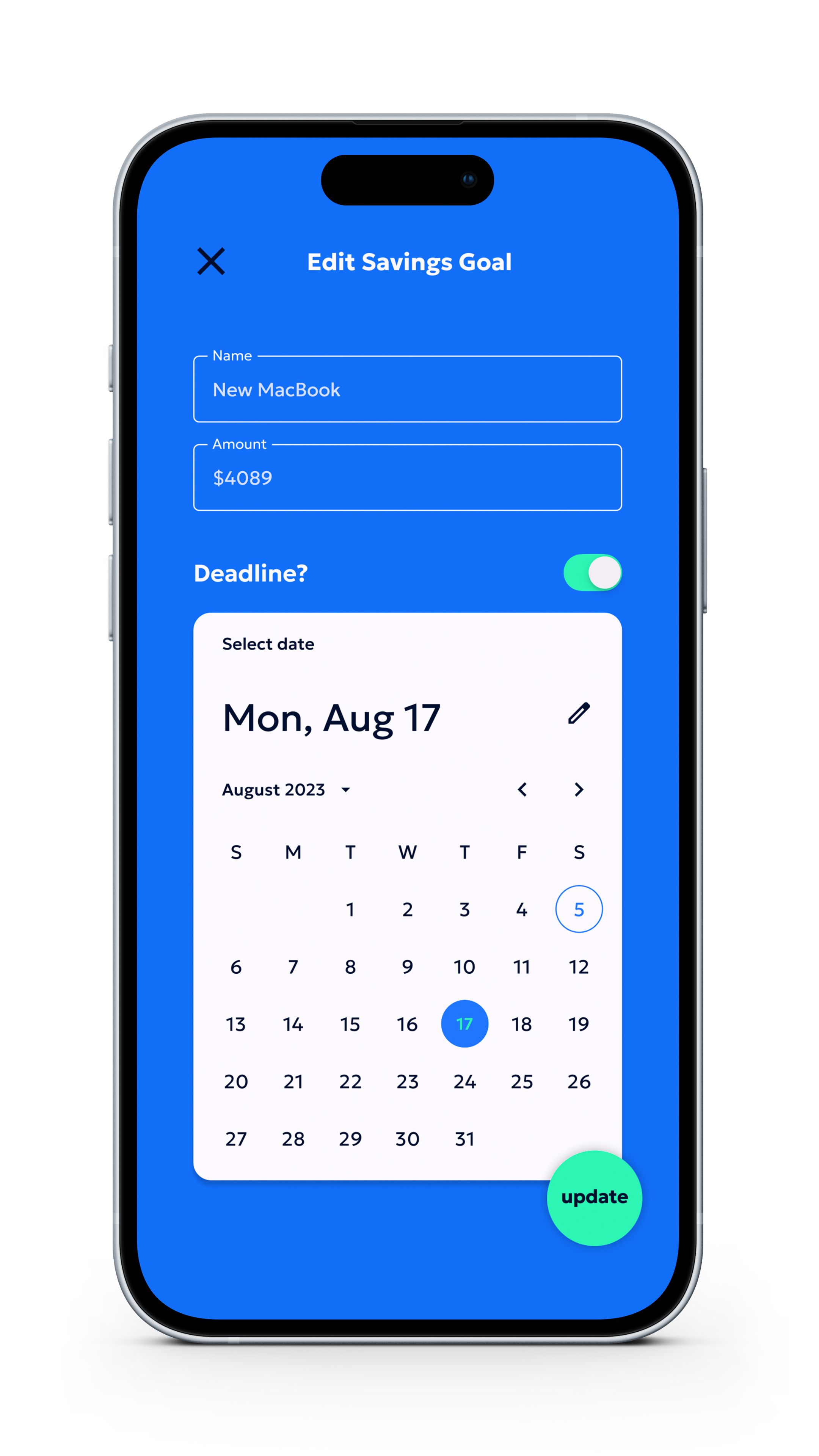
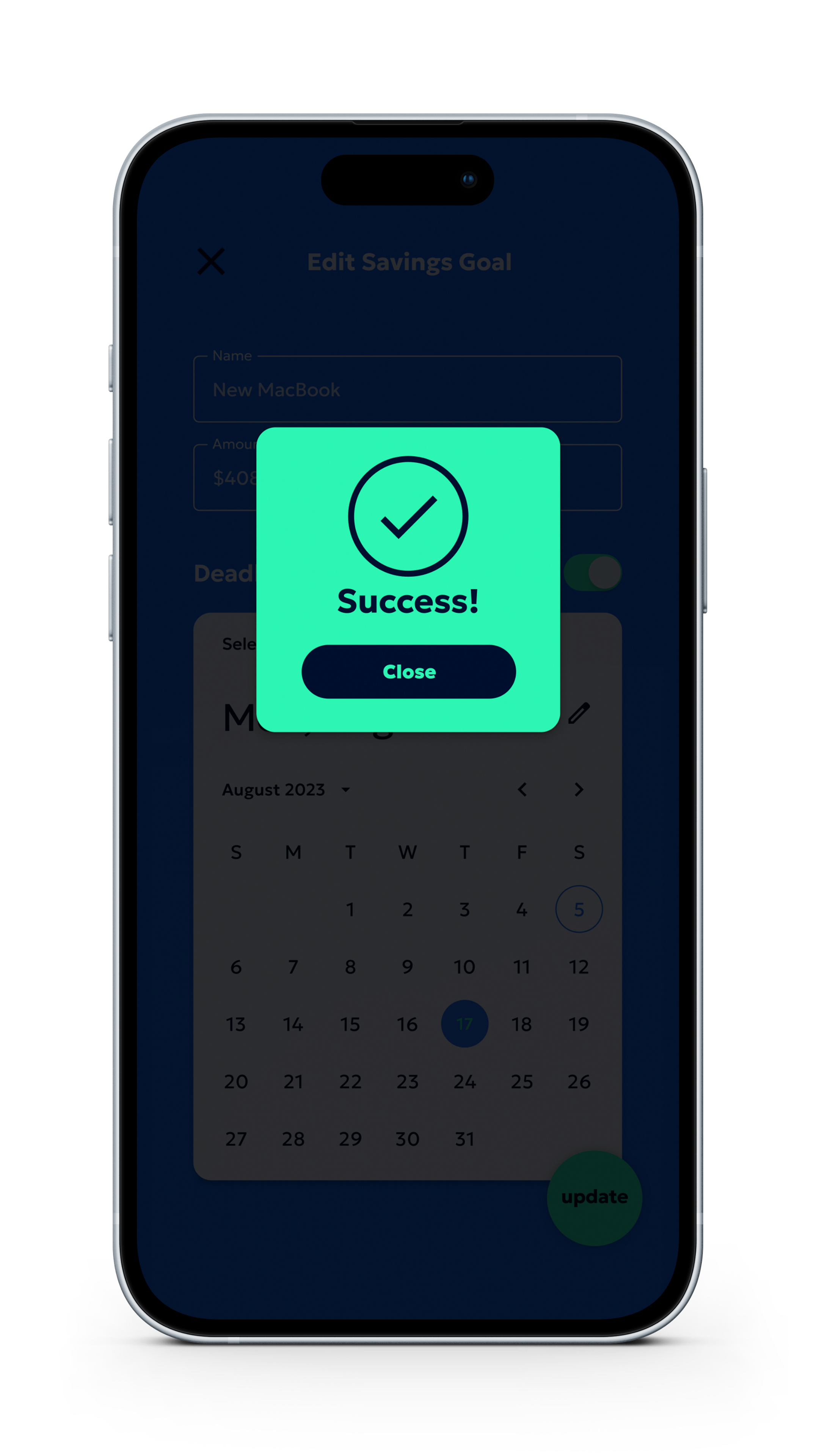
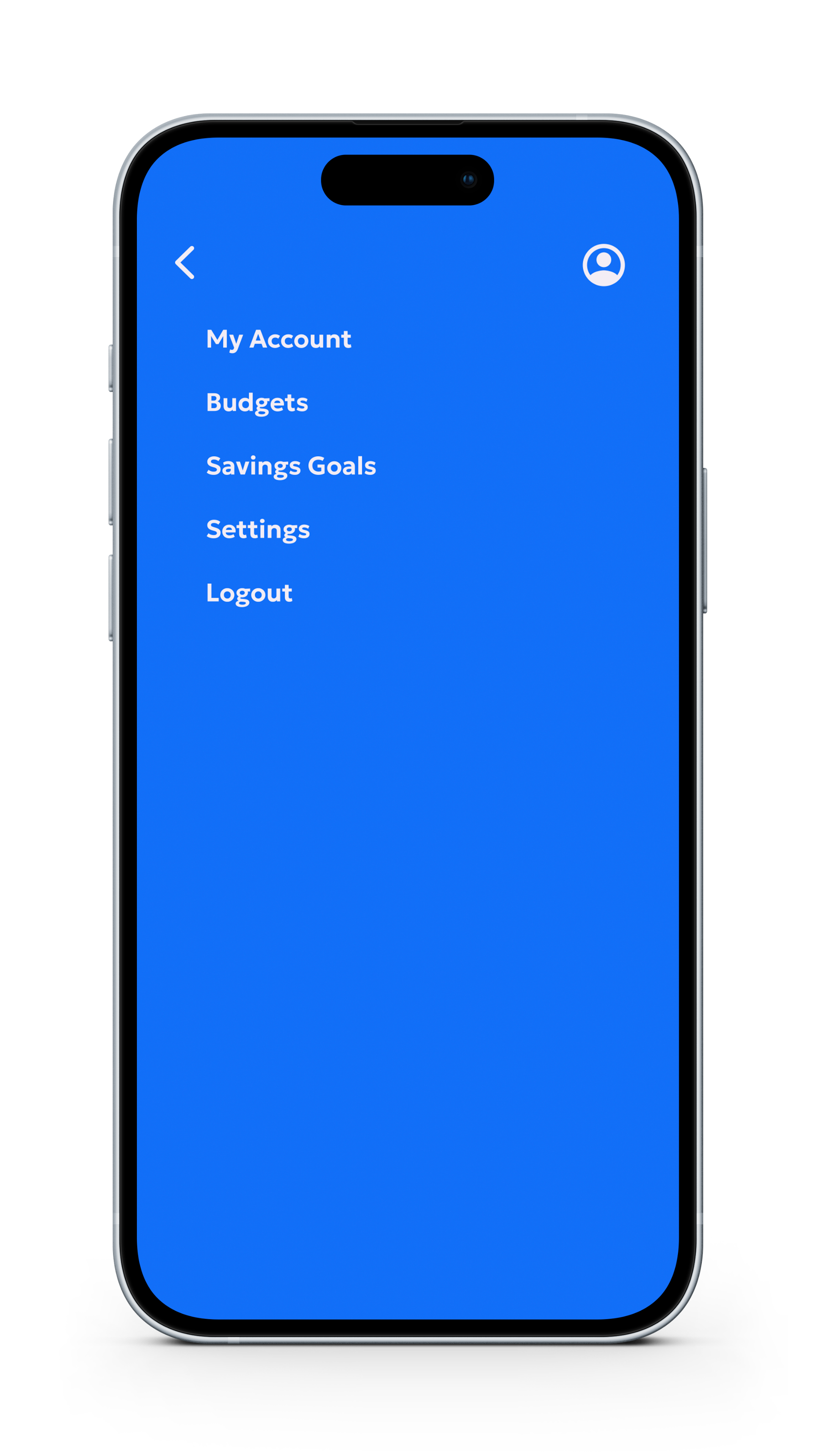
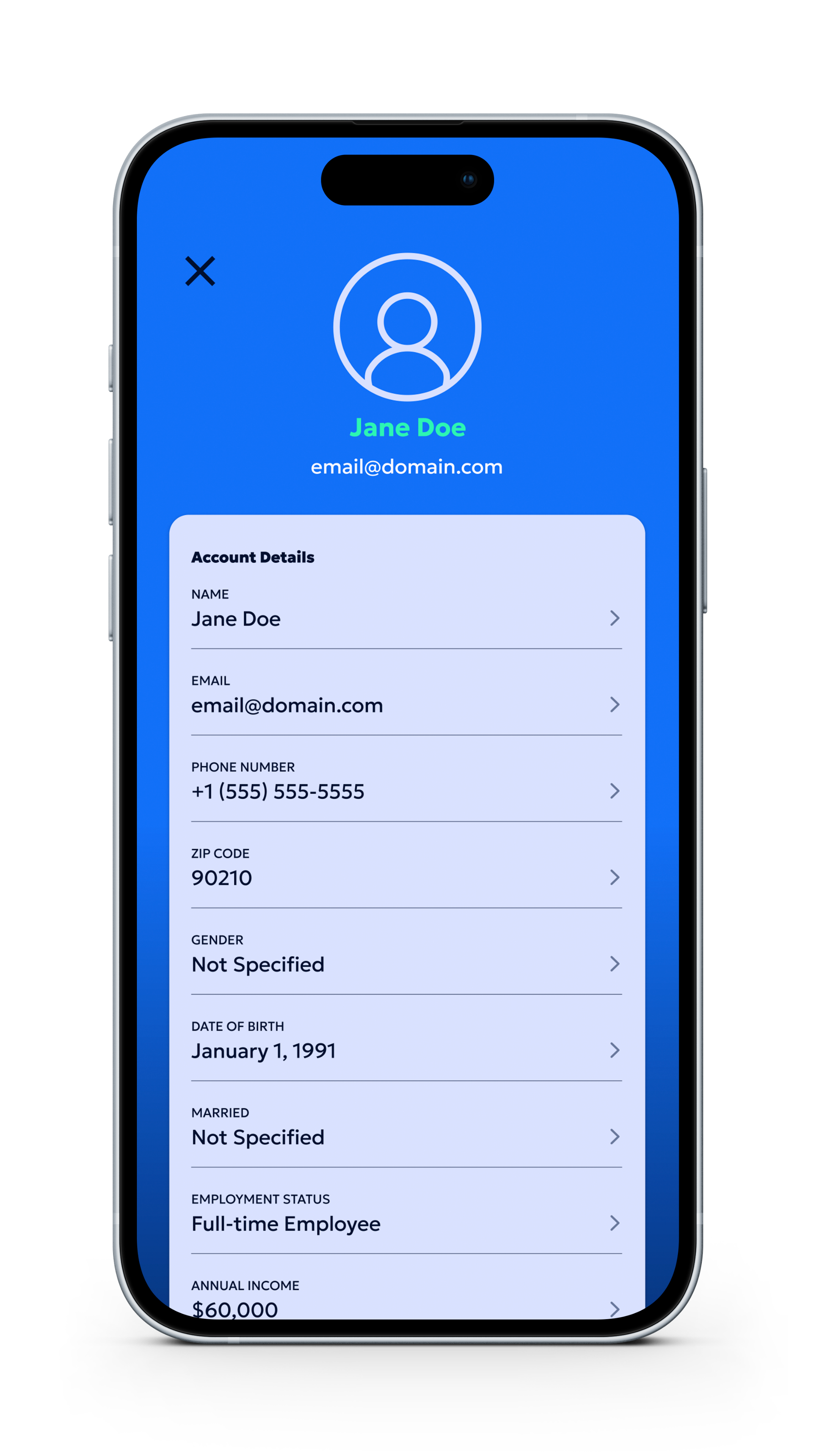
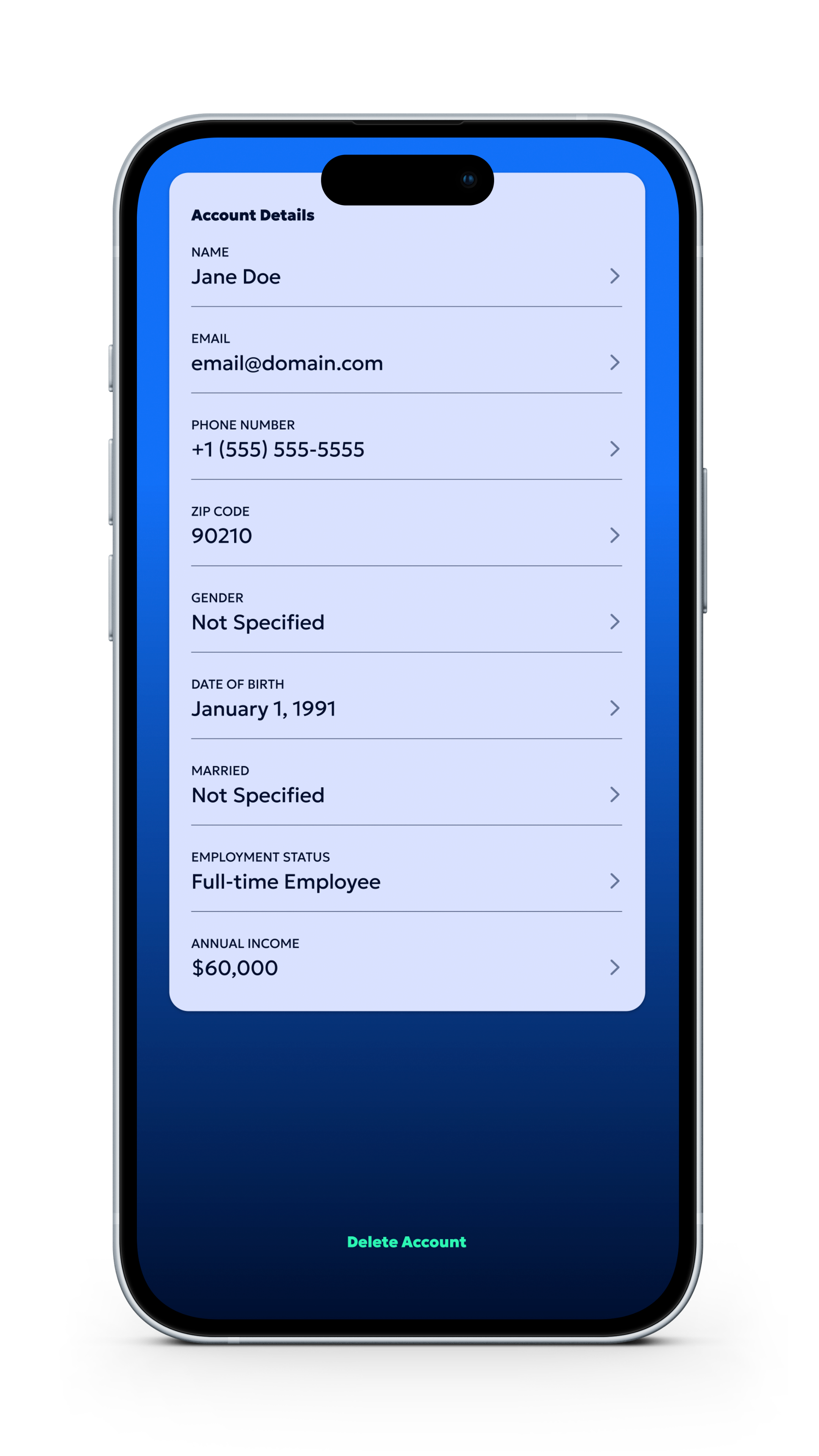
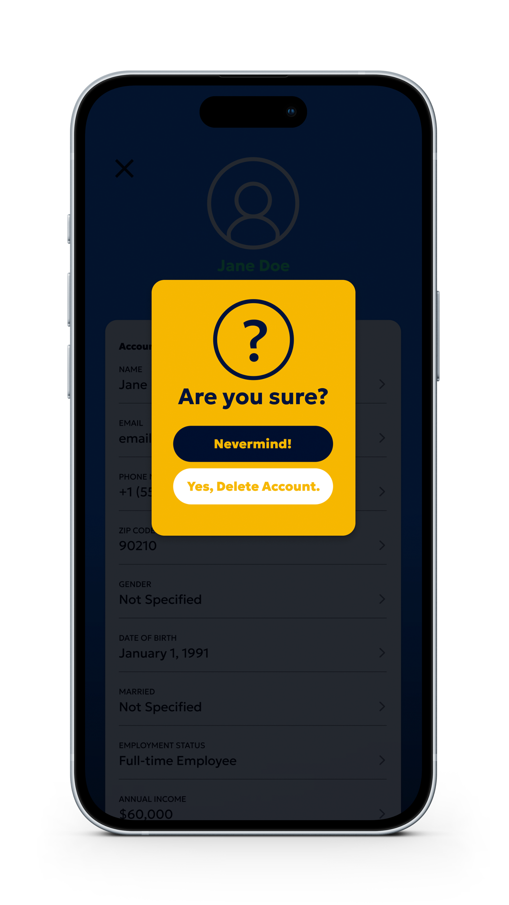
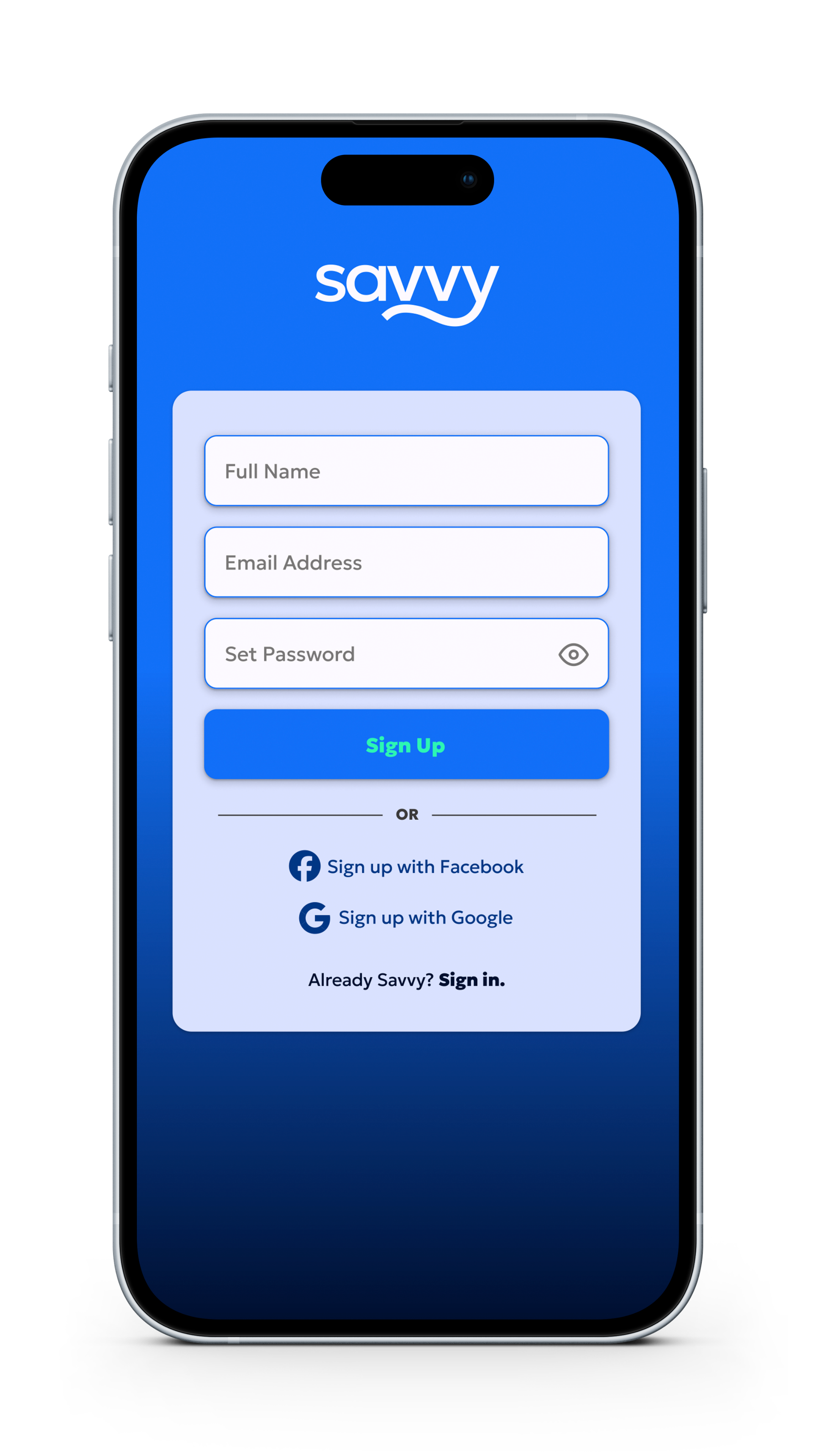
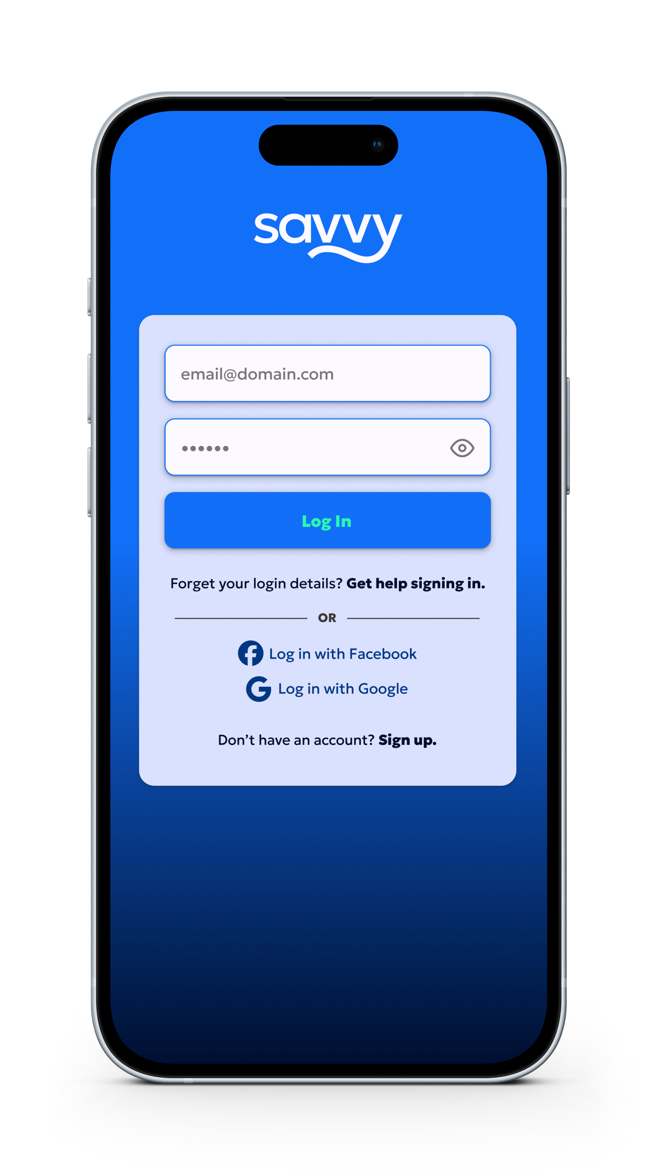
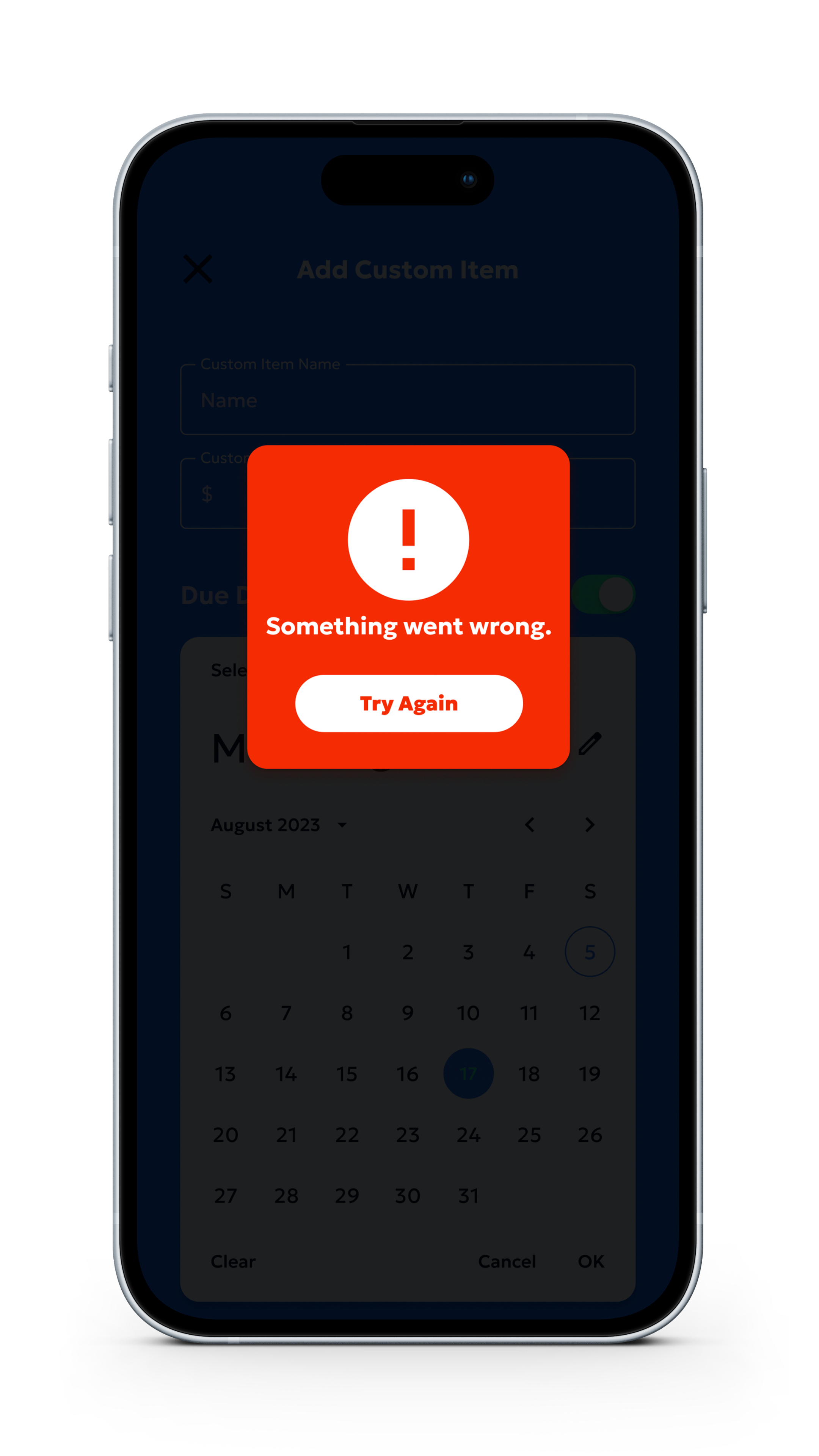
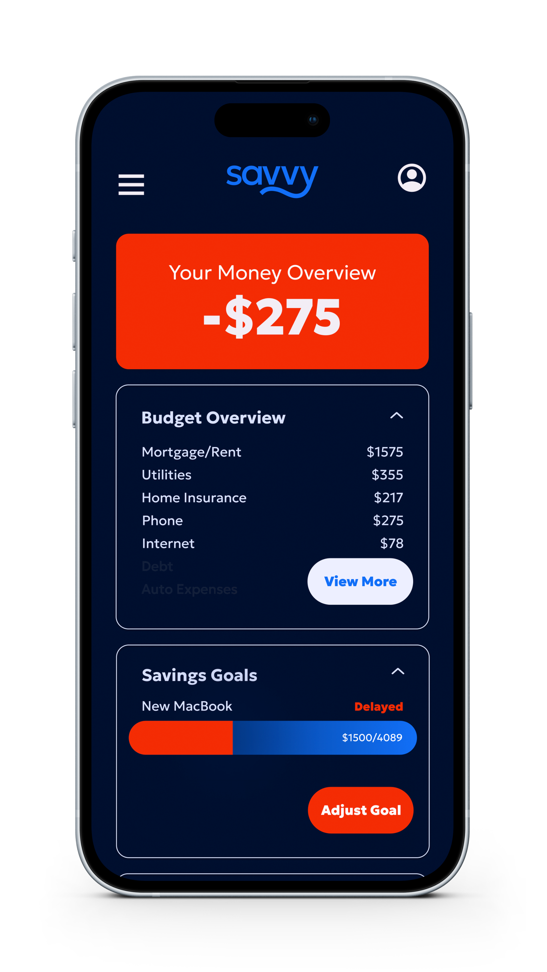
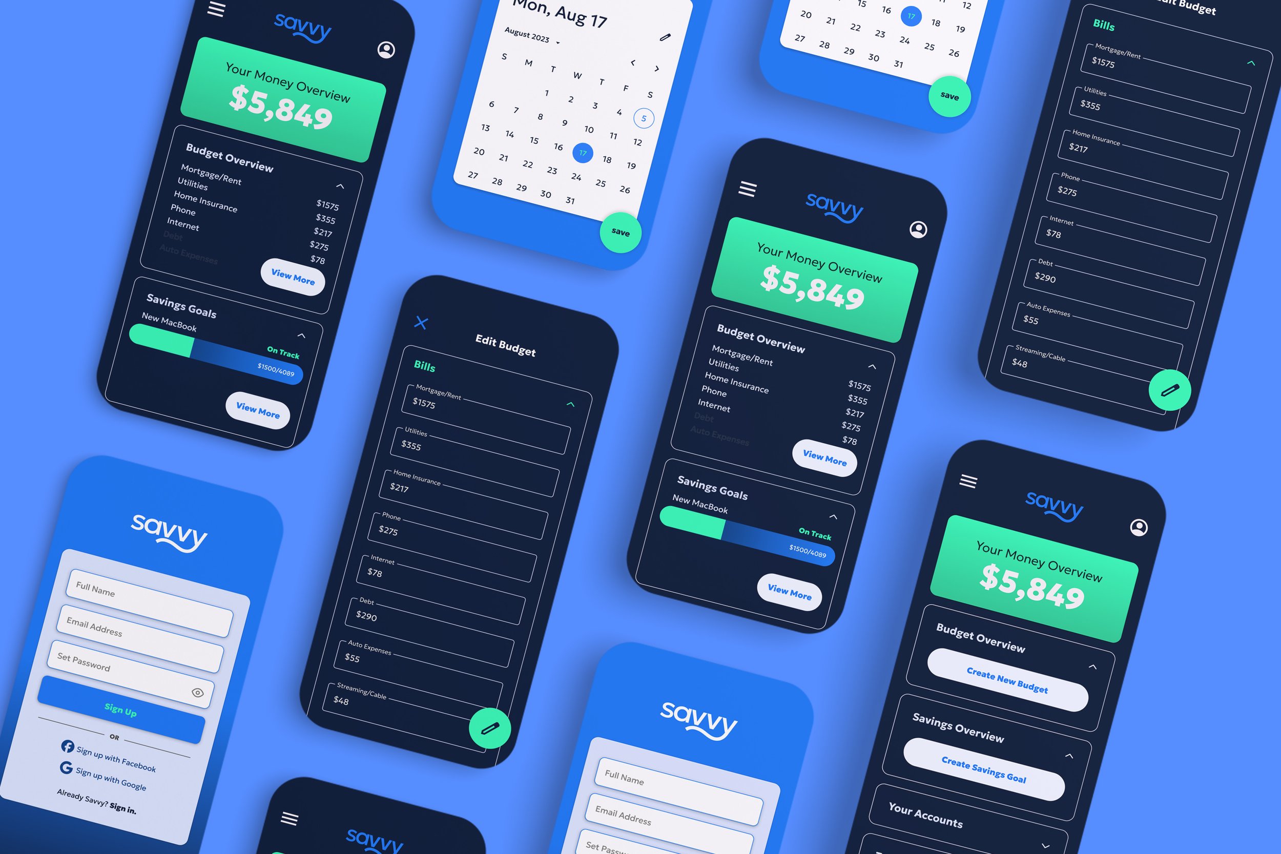
After using an affinity diagram to prioritize my insights, it was time to make Savvy beautiful! I created the visual identity for Savvy, informing the design of the hi-fi prototype. Check out the hi-fi prototype here: bit.ly/savvy-hifi
The Finished Product
